|
|
 Side of Software
|
Report Library TutorialTable of ContentsIntroductionThe Report Library is a report generation framework for
Java. It includes a Swing component to view, edit, and print reports. This
component,
The library consists of the following main components:
Report – A report is a visualization of an object. It breaks the object into hierarchical elements and associates attributes with each element. These attributes describe visual properties, such as the font, border, and background. Theme – A report theme holds the report’s attributes. The theme is kept separate from the content, making it easy to switch themes at any time. Report Template – A report template generates a report, given the report content and a theme. The library provides a table template that is flexible enough to produce most needed reports. Report Element – A hierarchical portion of the report. The library includes four types of elements: Object, Table, Tier, and Cell. Report Pane – A Swing component that can render a report as a single, continuous view. The report pane also provides methods to break the report into multiple pages. Report Selection Model – A model that controls which elements the user can select in the report pane. Report Editor Model – A model that controls how the user edits the report in the report pane.
To incorporate a report into an application, you must generally:
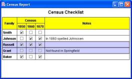
This tutorial steps you through the creation of a simple report. This simple report is a table that lists family names down the left side and censuses across the top. A value of true at a row-column intersection indicates that the family has been found in the census. The last column leaves room for notes. One can imagine this report being useful to a genealogist.
This tutorial is broken into four steps—each step adding functionality to the previous step. If you would like to jump directly to the source code, it can be found here:
The Report’s ContentIt is the programmer’s responsibility to provide the content of the report. Ideally, the content should come directly from the application’s domain model or a database; however, in this sample application, we merely hard-code the content:
Object[][] data = new Object[][] { { "Family", "1850 Census", "1860 Census", "1870 Census", "Notes" }, { "Smith", Boolean.TRUE, Boolean.FALSE, Boolean.FALSE, "" }, { "Johnson", Boolean.FALSE, Boolean.TRUE, Boolean.TRUE, "In 1860 spelled Johnssen" }, { "Russell", Boolean.TRUE, Boolean.TRUE, Boolean.TRUE, "" }, { "Grant", Boolean.FALSE, Boolean.FALSE, Boolean.FALSE, "Not found in Springfield" }, { "Baker", Boolean.TRUE, Boolean.FALSE, Boolean.TRUE, "" },}; We
choose to store the content in a two-dimensional array so that we can use The ReportWe
create the report by invoking the
TableReportTemplate template = new TableReportTemplate( "Census Template", 1, 1, 0, 0 ); Report report = template.createReport( data );
In
the above code, the 1s passed to the constructor of
In the above code, the template uses a default theme that describes the report’s appearance. We will specify a custom theme in a later section. The Report PaneOnce we have created the report, we place it in a report pane and scroll pane: JReportPane reportPane = new JReportPane( report ); JScrollPane scrollPane = new JScrollPane( reportPane ); The report pane creates views that are responsible for rendering the report. Since the report may wish to be larger than its container (especially if the window is resized), we place the report pane in a scroll pane. Putting It TogetherThe complete program, up to this point, is
import javax.swing.*; import sos.reports.*; public class TutorialExample {public static void main( String[] args ) { SwingUtilities.invokeLater( new Runnable() {public void run() { Object[][] data = new Object[][] { { "Family", "1850 Census", "1860 Census", "1870 Census", "Notes" }, { "Smith", Boolean.TRUE, Boolean.FALSE, Boolean.FALSE, "" }, { "Johnson", Boolean.FALSE, Boolean.TRUE, Boolean.TRUE, "In 1860 spelled Johnssen" }, { "Russell", Boolean.TRUE, Boolean.TRUE, Boolean.TRUE, "" }, { "Grant", Boolean.FALSE, Boolean.FALSE, Boolean.FALSE, "Not found in Springfield" }, { "Baker", Boolean.TRUE, Boolean.FALSE, Boolean.TRUE, "" },}; TableReportTemplate template = new TableReportTemplate( "Census Template", 1, 1, 0, 0 ); Report report = template.createReport( data ); JReportPane reportPane = new JReportPane( report ); JScrollPane scrollPane = new JScrollPane( reportPane ); JFrame frame = new JFrame( "Census Report" ); frame.getContentPane().add( scrollPane ); frame.setDefaultCloseOperation( JFrame.EXIT_ON_CLOSE ); frame.setSize( 500, 300 ); frame.show(); } } ); } }
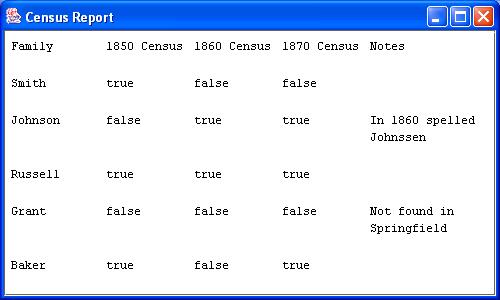
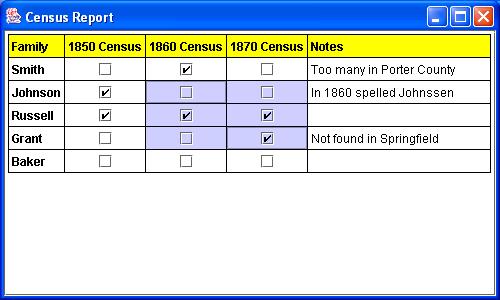
We have taken a two-dimensional array of data and produced the following report
As you can see, it only takes a few lines of code to produce a report. It takes a little more effort to get it to look and behave exactly as desired. In the next section, we spice up the report’s appearance by specifying visual attributes and a theme. Then we allow the user to edit and interact with the report. The Report’s AppearanceThe
appearance of the above report is not terribly exciting because the default
theme for AttributesThe Report Library uses attributes to determine how to render a report. Attributes are used in the same way that attributes are used in Swing’s text framework. In fact, the same style constants are recognized:
Each
of these attributes can be set by invoking the appropriate static method in
StyleConstants.setBold( headerAttributes, true );
and to set the font family for the entire table, we write
StyleConstants.setFontFamily( tableAttributes, "San Serif" );
where
In
addition to the attributes defined in
The
class
ReportStyleConstants.setBackgroundFill( headerRowAttributes, Fill.YELLOW );
(We recommend using the BackgroundFill attribute, which can handle gradients and multiple colors, instead of StyleConstants.Background.) The following lines of code give our table a grid and a border.
ReportStyleConstants.setHorizontalGridThickness( tableAttributes, 1.0 ); ReportStyleConstants.setVerticalGridThickness( tableAttributes, 1.0 ); ReportStyleConstants.setBorderThickness( tableAttributes, 1.0 );
The
default table-sizing algorithm tries to give all rows and columns their
preferred sizes. If there is space left over, it gives them an equal
proportion of leftover space. The
ReportStyleConstants.setFillProportion( tierAttributes, 0 ); ReportStyleConstants.setFillProportion( lastColumnAttributes, 1 );
to indicate that all but the last column have 0 as their fill proportion. We say more about table attributes and attribute resolution in the following sections. Table AttributesThere
is a special attribute,
public interface TableFormat {public AttributeSet getTableAttributes( TableElement tableElement ); public AttributeSet getTierAttributes( TierElement tierElement ); public AttributeSet getCellAttributes( CellElement cellElement ); }
The
library provides three factory methods defined in
public static TableFormat createColumnOrientedTableFormat( AttributeSet[] headerAttributes, AttributeSet[] bodyAttributes, AttributeSet[] footerAttributes ); public static TableFormat createRowOrientedTableFormat( AttributeSet[] headerAttributes, AttributeSet[] bodyAttributes, AttributeSet[] footerAttributes ); public static TableFormat createCompositeTableFormat( TableFormat tableFormat1, TableFormat tableFormat2 );
The first two methods generate a table format given attribute sets for header tiers, body tiers, and footer tiers. Each parameter is an array so the attribute sets are applied in a cyclic fashion. The third factory method creates a table style that is the composition of two other table styles.
Another
useful class in the library is
Our
example uses
DefaultTableFormat defaultTableFormat = new DefaultTableFormat(); We define and set the table attributes
// the table's attributes MutableAttributeSet tableAttributes = new SimpleAttributeSet(); // ... define the table attributes defaultTableFormat.setTableAttributes( tableAttributes ); the attributes for the column’s non-header and non-footer cells
// use a checkbox renderer for columns 2, 3, and 4 MutableAttributeSet bodyAttributes = new SimpleAttributeSet(); // ... define the attributes for columns 2, 3, and 4 defaultTableFormat.setColumnCellAttributes( bodyAttributes, 1, DefaultTableFormat.BODY ); defaultTableFormat.setColumnCellAttributes( bodyAttributes, 2, DefaultTableFormat.BODY ); defaultTableFormat.setColumnCellAttributes( bodyAttributes, 3, DefaultTableFormat.BODY ); the tier attributes
// do not let a row or column be wider than its preferred size MutableAttributeSet tierAttributes = new SimpleAttributeSet(); // ... define the attributes for all rows and columns defaultTableFormat.setTierAttributes( tierAttributes ); the last column’s attributes
// the last column can wrap and should take up any extra space MutableAttributeSet lastColumnAttributes = new SimpleAttributeSet(); // ... define the attributes for the last column defaultTableFormat.setColumnAttributes( lastColumnAttributes, -1 ); and the header row and column attributes
// text in the header row and column is bold MutableAttributeSet headerAttributes = new SimpleAttributeSet(); // ... define the attributes for the header rows and columns // the header row is yellow MutableAttributeSet headerRowAttributes = new SimpleAttributeSet(); // ... define the attributes for the header rows defaultTableFormat.setRowAttributes( headerRowAttributes, DefaultTableFormat.HEADER ); defaultTableFormat.setColumnAttributes( headerAttributes, DefaultTableFormat.HEADER );
Once we have created our table format, we must associate it with the report’s table element. The next section describes how a report theme accomplishes this. Report ThemesIn
order to generate a report, a report template needs a theme. The theme is a named
collection of styles that the report may use. (Recall that a style in Swing
is merely a named attribute set.) The
public interface Theme {String getName(); Style getStyle( String name ); Set getStyleNames(); }
All
report templates are required to provide a default theme. If you choose not
to use the default theme, you must supply your own either by defining a class
that implements
Generally,
it is up to the report template as to what style names are required or
acceptable.
For example, when rendering a table, the library searches the theme for a style named “Table.” When rendering the cell content in row 6, column 5, the library use the style named “Cell6,5Object.”
Our
example makes use of this naming convention. It creates a style named “Table”
and defines the
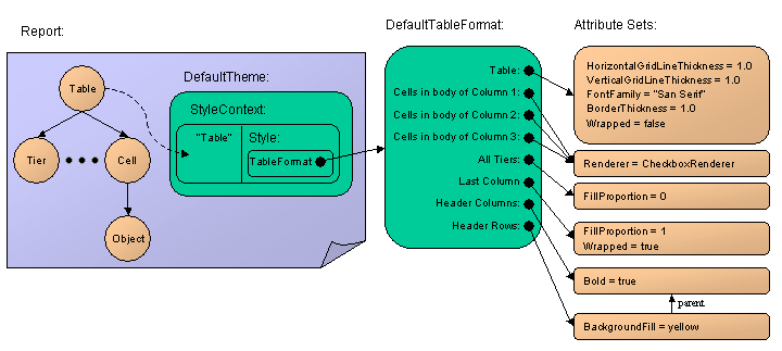
StyleContext styleContext = new StyleContext(); Style tableStyle = styleContext.addStyle( "Table", null ); ReportStyleConstants.setTableFormat( tableStyle, defaultTableFormat ); Theme theme = new DefaultTheme( "Default Table Report Template Theme", styleContext ); Here is a diagram of the styles and attributes used in our sample application:
In
summary, we have a report that consists of a hierarchy of elements and a
theme. The table element’s attributes are those referred to as “Table” in the
theme. This attribute set (in this case a Attribute ResolutionIt is important to understand how the library resolves attributes. The rendering process looks for an attribute in the attribute set associated with the report element. If it does not find the attribute, it looks in the appropriate place in the table format and then checks the parent element’s set. The process continues until it finds the attribute in question. If no attribute set includes the attribute, the default value is used.
Specifically, the following pseudo-algorithm shows the order that attribute sets are searched:
RESOLVE_ATTRIBUTE(Element element): 1. Call RETRIEVE( element ) 2. If cell element and inherited attribute, RETRIEVE( cell’s first row ) 3. If cell element and inherited attribute, RETRIEVE( cell’s first column ) 4. If inherited attribute, RESOLVE_ATTRIBUTE( element’s parent ) RETRIEVE(Element element): A. Check element’s attribute set (and the set’s resolve parent recursively) B. If cell element, check its enclosing table format (if any) C. If tier element, check its enclosing table format (if any) D. If table element, check its table format (if any)
In
our example, text in the last column should wrap so the user does not have to
scroll horizontally to read extremely long notes. All other text in the
report should appear as a single line. We achieve this by setting the
ReportStyleConstants.setWrapped( tableAttributes, false ); ReportStyleConstants.setWrapped( lastColumnAttributes, true );
Let’s
examine the resolution order to see why this works. When the library wants to
know if it should allow the text “Not found in Springfield” to span multiple
lines, it first checks the object element’s attribute set. It discovers that
there is no style named “Cell4,4Object” in the theme. Thus, the attribute set
associated with the element (Step A) is empty. Steps B – D do not apply since
the element is an object element. Similarly, Steps 2 and 3 do not apply.
Since the
The
library finds no style named “Cell4,4” in the theme, so Step A does not find
the attribute. Step B is applicable, so it searches for the enclosing table
format. In the parent table element, it finds our
Now
suppose we want to know if the text “Johnson” should wrap. The same logic as
before applies, however, when it invokes
We leave it as an exercise to trace the resolution of the other attributes in our example. There are often many ways to achieve the same visual appearance. Object RenderingAn object in the report may be rendered as a nested report, with a custom renderer, or as text—in that order of precedence.
Rendering
as a Nested Report. An object is rendered as a nested report if the
Rendering
with an Element Renderer. If no template is found, then the rendering
process looks for an element renderer associated with the
ReportStyleConstants.setRenderer( bodyAttributes, new CheckBoxElementRenderer() );
where
class CheckBoxElementRenderer implements ElementRenderer {// if the value is null, we'll use a blank label; otherwise, we'll // use a checkbox static final private Component BLANK = new JLabel(); private JCheckBox checkBox = new JCheckBox(); public CheckBoxElementRenderer() {super(); checkBox.setHorizontalAlignment( JLabel.CENTER ); checkBox.setOpaque( false ); } public Component getElementRendererComponent(JReportPane reportPane, Element element) {Boolean object = (Boolean)element.getObject(); // don't use a checkbox if null if( object == null ) return BLANK; // initialize the checkbox appropriately boolean selected = object != null && object.booleanValue(); checkBox.setSelected( selected ); return checkBox; } }
The
renderer must implement
Rendering
as Text. If no template or renderer is found, then the object is rendered
as text. The text is gotten by feeding the object into the Putting It TogetherThe complete program, with a custom theme, is
import java.awt.*; import javax.swing.*; import javax.swing.text.*; import sos.reports.*; public class TutorialExample2 {public static void main(String[] args) { SwingUtilities.invokeLater( new Runnable() {public void run() { Object[][] data = new Object[][] { { "Family", "1850 Census", "1860 Census", "1870 Census", "Notes" }, { "Smith", Boolean.TRUE, Boolean.FALSE, Boolean.FALSE, "" }, { "Johnson", Boolean.FALSE, Boolean.TRUE, Boolean.TRUE, "In 1860 spelled Johnssen" }, { "Russell", Boolean.TRUE, Boolean.TRUE, Boolean.TRUE, "" }, { "Grant", Boolean.FALSE, Boolean.FALSE, Boolean.FALSE, "Not found in Springfield" }, { "Baker", Boolean.TRUE, Boolean.FALSE, Boolean.TRUE, "" },}; // create the table format DefaultTableFormat defaultTableFormat = new DefaultTableFormat(); // the table's attributes MutableAttributeSet tableAttributes = new SimpleAttributeSet(); ReportStyleConstants.setHorizontalGridThickness( tableAttributes, 1.0 ); ReportStyleConstants.setVerticalGridThickness( tableAttributes, 1.0 ); StyleConstants.setFontFamily( tableAttributes, "San Serif" ); ReportStyleConstants.setBorderThickness( tableAttributes, 1.0 ); ReportStyleConstants.setWrapped( tableAttributes, false ); defaultTableFormat.setTableAttributes( tableAttributes ); // use a checkbox renderer for columns 2, 3, and 4 MutableAttributeSet bodyAttributes = new SimpleAttributeSet(); ReportStyleConstants.setRenderer( bodyAttributes, new CheckBoxElementRenderer() ); defaultTableFormat.setColumnCellAttributes( bodyAttributes, 1, DefaultTableFormat.BODY ); defaultTableFormat.setColumnCellAttributes( bodyAttributes, 2, DefaultTableFormat.BODY ); defaultTableFormat.setColumnCellAttributes( bodyAttributes, 3, DefaultTableFormat.BODY ); // do not let a row or column be wider than its preferred size MutableAttributeSet tierAttributes = new SimpleAttributeSet(); ReportStyleConstants.setFillProportion( tierAttributes, 0 ); defaultTableFormat.setTierAttributes( tierAttributes ); // the last column can wrap and should take up any extra space MutableAttributeSet lastColumnAttributes = new SimpleAttributeSet(); ReportStyleConstants.setWrapped( lastColumnAttributes, true ); ReportStyleConstants.setFillProportion( lastColumnAttributes, 1 ); defaultTableFormat.setColumnAttributes( lastColumnAttributes, -1 ); // text in the header row and column is bold MutableAttributeSet headerAttributes = new SimpleAttributeSet(); StyleConstants.setBold( headerAttributes, true ); // the header row is yellow MutableAttributeSet headerRowAttributes = new SimpleAttributeSet(); headerRowAttributes.setResolveParent( headerAttributes ); ReportStyleConstants.setBackgroundFill( headerRowAttributes, Fill.YELLOW ); defaultTableFormat.setRowAttributes( headerRowAttributes, DefaultTableFormat.HEADER ); defaultTableFormat.setColumnAttributes( headerAttributes, DefaultTableFormat.HEADER ); StyleContext styleContext = new StyleContext(); Style tableStyle = styleContext.addStyle( "Table", null ); ReportStyleConstants.setTableFormat( tableStyle, defaultTableFormat ); Theme theme = new DefaultTheme( "Default Table Report Template Theme", styleContext ); TableReportTemplate template = new TableReportTemplate( "Census Template", 1, 1, 0, 0 ); Report report = template.createReport( data, theme ); JReportPane reportPane = new JReportPane( report ); JScrollPane scrollPane = new JScrollPane( reportPane ); JFrame frame = new JFrame( "Census Report" ); frame.getContentPane().add( scrollPane ); frame.setDefaultCloseOperation( JFrame.EXIT_ON_CLOSE ); frame.setSize( 500, 300 ); frame.show(); } } ); } }
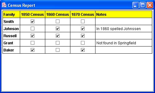
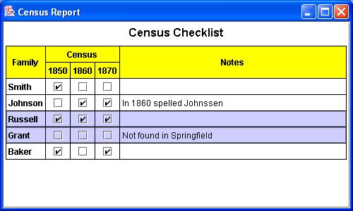
Now our report looks more elegant:
The Report’s BehaviorReports produced with this library are unique in that they do not have to be read-only. If we install a selection model, the user can interact with the report by selecting elements; if we install an editor model, the user can edit the content. In this section, we enhance our sample application by allowing the user to select rows and cells and by making most of the cells editable. Selection ModelThe selection model determines what report elements the user can select. By default, the report pane allows no selection; however, we can install an alternate model with the code:
reportPane.setSelectionModel( selectionModel );
where
The
library provides four types of selection models: cell selection, row and
column selection, composite selection, and template-based selection. These
selection models should meet most applications’ needs. If not, you can create
a new selection model by subclassing
Cell
Selection.
ReportSelectionModel cellSelectionModel = new CellReportSelectionModel();
Tier
Selection.
When you create a tier selection model, you specify either rows or columns. In our example, we enable row selection, which may be useful for the user to insert or delete family names.
ReportSelectionModel rowSelectionModel = new TierReportSelectionModel( TableElement.ROW );
Composite
Selection.
CompositeReportSelectionModel selectionModel = new CompositeReportSelectionModel(); selectionModel.addSelectionModel( cellSelectionModel ); selectionModel.addSelectionModel( rowSelectionModel );
Since we add cell selection first, it takes precedence over row selection. You can apply a similar technique to add column selection. It is this composite selection model that is installed in the report pane. When the user selects an element in the first column, the row is highlighted. When the user selects other cells, only the cell is highlighted. Cells in the header row, however, are not selectable.
Template-Based
Selection. The fourth selection model,
To
respond to changes in the selection, regardless of the selection model, you
can register a Editor ModelThe editor model controls how the user can edit the report. When the user makes an editing gesture (such as double-clicking or pressing F2), the report pane first asks the report if editing is allowed and then asks the editor model for the appropriate editor. If the report returns true and the editor model returns a non-null editor, then the report pane installs an editor component, and editing begins. The editor component may be any AWT or Swing component.
By default, the report pane uses an editor model that does not allow any editing; however, we can install an alternative model with the call
reportPane.setEditorModel( editorModel ); where
The
library provides three types of editor models: editing based on class type,
editing based on row or column index, and template-based editing. If these
predefined models do not suit your needs, you can create a new editor model
by subclassing
Class-Based
Editor Model. The
Tier
Editor Model. The second editor model,
Template-Based
Editor Model. Finally,
In
our example, we want to use a check box to edit the Boolean cells and a text
field to edit the notes. Since the Boolean cells appear in columns 1, 2, and
3 and the notes appear in column 4, we can use an instance of
TierReportEditorModel editorModel = new TierReportEditorModel( TableElement.COLUMN ); editorModel.setTierEditor( 1, checkBoxEditor ); editorModel.setTierEditor( 2, checkBoxEditor ); editorModel.setTierEditor( 3, checkBoxEditor ); editorModel.setTierEditor( 4, textFieldEditor);
Since
the editors must implement
JCheckBox checkBox = new JCheckBox(); checkBox.setOpaque( false ); checkBox.setHorizontalAlignment( SwingConstants.CENTER ); ElementEditor checkBoxEditor = new DefaultElementEditor( checkBox ); JTextField textField = new JTextField(); ElementEditor textFieldEditor = new DefaultElementEditor( textField );
We center the checkbox and make it transparent so that it matches our custom checkbox renderer.
After
the user edits a value in the report, the new value is saved in our array.
This allows us to access the updated data later, if we need to. If we need to
take an action as soon as the value is set, we should use a Putting It TogetherAdding a composite selection model and a column-based editor model to our application, we get
import java.awt.*; import javax.swing.*; import javax.swing.text.*; import sos.reports.*; public class TutorialExample3 {public static void main(String[] args) { SwingUtilities.invokeLater( new Runnable() {public void run() { Object[][] data = new Object[][] { { "Family", "1850 Census", "1860 Census", "1870 Census", "Notes" }, { "Smith", Boolean.TRUE, Boolean.FALSE, Boolean.FALSE, "" }, { "Johnson", Boolean.FALSE, Boolean.TRUE, Boolean.TRUE, "In 1860 spelled Johnssen" }, { "Russell", Boolean.TRUE, Boolean.TRUE, Boolean.TRUE, "" }, { "Grant", Boolean.FALSE, Boolean.FALSE, Boolean.FALSE, "Not found in Springfield" }, { "Baker", Boolean.TRUE, Boolean.FALSE, Boolean.TRUE, "" },}; // create the table format DefaultTableFormat defaultTableFormat = new DefaultTableFormat(); // the table's attributes MutableAttributeSet tableAttributes = new SimpleAttributeSet(); ReportStyleConstants.setHorizontalGridThickness( tableAttributes, 1.0 ); ReportStyleConstants.setVerticalGridThickness( tableAttributes, 1.0 ); StyleConstants.setFontFamily( tableAttributes, "San Serif" ); ReportStyleConstants.setBorderThickness( tableAttributes, 1.0 ); ReportStyleConstants.setWrapped( tableAttributes, false ); defaultTableFormat.setTableAttributes( tableAttributes ); // use a checkbox renderer for columns 2, 3, and 4 MutableAttributeSet bodyAttributes = new SimpleAttributeSet(); ReportStyleConstants.setRenderer( bodyAttributes, new CheckBoxElementRenderer() ); defaultTableFormat.setColumnCellAttributes( bodyAttributes, 1, DefaultTableFormat.BODY ); defaultTableFormat.setColumnCellAttributes( bodyAttributes, 2, DefaultTableFormat.BODY ); defaultTableFormat.setColumnCellAttributes( bodyAttributes, 3, DefaultTableFormat.BODY ); // do not let a row or column be wider than its preferred size MutableAttributeSet tierAttributes = new SimpleAttributeSet(); ReportStyleConstants.setFillProportion( tierAttributes, 0 ); defaultTableFormat.setTierAttributes( tierAttributes ); // the last column can wrap and should take up any extra space MutableAttributeSet lastColumnAttributes = new SimpleAttributeSet(); ReportStyleConstants.setWrapped( lastColumnAttributes, true ); ReportStyleConstants.setFillProportion( lastColumnAttributes, 1 ); defaultTableFormat.setColumnAttributes( lastColumnAttributes, -1 ); // text in the header row and column is bold MutableAttributeSet headerAttributes = new SimpleAttributeSet(); StyleConstants.setBold( headerAttributes, true ); // the header row is yellow MutableAttributeSet headerRowAttributes = new SimpleAttributeSet(); headerRowAttributes.setResolveParent( headerAttributes ); ReportStyleConstants.setBackgroundFill( headerRowAttributes, Fill.YELLOW ); defaultTableFormat.setRowAttributes( headerRowAttributes, DefaultTableFormat.HEADER ); defaultTableFormat.setColumnAttributes( headerAttributes, DefaultTableFormat.HEADER ); StyleContext styleContext = new StyleContext(); Style tableStyle = styleContext.addStyle( "Table", null ); ReportStyleConstants.setTableFormat( tableStyle, defaultTableFormat ); Theme theme = new DefaultTheme( "Default Table Report Template Theme", styleContext ); TableReportTemplate template = new TableReportTemplate( "Census Template", 1, 1, 0, 0 ); Report report = template.createReport( data, theme ); JReportPane reportPane = new JReportPane( report ); // allow cells to be selected ReportSelectionModel cellSelectionModel = new CellReportSelectionModel(); ReportSelectionModel rowSelectionModel = new TierReportSelectionModel( TableElement.ROW ); CompositeReportSelectionModel selectionModel = new CompositeReportSelectionModel(); selectionModel.addSelectionModel( cellSelectionModel ); selectionModel.addSelectionModel( rowSelectionModel ); reportPane.setSelectionModel( selectionModel ); // cells with checkboxes can be clicked JCheckBox checkBox = new JCheckBox(); checkBox.setOpaque( false ); checkBox.setHorizontalAlignment( SwingConstants.CENTER ); ElementEditor checkBoxEditor = new DefaultElementEditor( checkBox ); // the notes cells can be edited JTextField textField = new JTextField(); ElementEditor textFieldEditor = new DefaultElementEditor( textField ); // the editor to use depends on the column TierReportEditorModel editorModel = new TierReportEditorModel( TableElement.COLUMN ); editorModel.setTierEditor( 1, checkBoxEditor ); editorModel.setTierEditor( 2, checkBoxEditor ); editorModel.setTierEditor( 3, checkBoxEditor ); editorModel.setTierEditor( 4, textFieldEditor ); // allow cells to be edited reportPane.setEditorModel( editorModel ); JScrollPane scrollPane = new JScrollPane( reportPane ); JFrame frame = new JFrame( "Census Report" ); frame.getContentPane().add( scrollPane ); frame.setDefaultCloseOperation( JFrame.EXIT_ON_CLOSE ); frame.setSize( 500, 300 ); frame.show(); } } ); } }
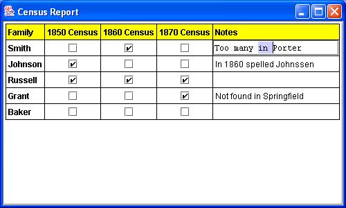
After the user clicks some checkboxes and edits the notes, our report may look something like this
Here is a screen shot of the report with some cells selected:
Advanced FeaturesIn the previous section, we enhanced the report pane by specifying a selection model and editor model. In this section, we enhance the report further by adding a title and by merging cells. Nested ReportsA titled report is merely a table report with one column and two rows—a row for the title and a row for the body, where the body is a nested report. The string “Census Checklist” will serve as the report’s title, while the two-dimensional array will be the body of the report. We can create the report just as we did before, using a table report template:
Object[] content = new Object[] { title, body };ReportTemplate template = new TableReportTemplate(); Report report = template.createReport( content, theme );
Recall that the attributes control how the body is rendered. Since we wish to render it as a nested report, we must specify the report template and theme in the appropriate attribute set:
ReportStyleConstants.setTemplate( bodyAttributes, bodyTemplate ); ReportStyleConstants.setTheme( bodyAttributes, bodyTheme );
where
Since
we now have a nested report, we must adjust our selection and editor models.
Recall that
ReportSelectionModel selectionModel = new TemplateReportSelectionModel( "Census Template", compositeSelectionModel );
On
a similar note, our element editors are registered for columns 1, 2, 3, and
4. Since this only applies to our nested table, we use
ReportEditorModel editorModel = new TemplateReportEditorModel( "Census Template", tierEditorModel ); Cell StraddlingTables
can support cell straddling, or merged cells. In other words, a cell can span
multiple rows and/or columns. The class
Object[][] data = new Object[][] { { "Family", "Census", TableReportTemplate.STRADDLE_PREVIOUS_COLUMN,TableReportTemplate.STRADDLE_PREVIOUS_COLUMN, "Notes" }, { TableReportTemplate.STRADDLE_PREVIOUS_ROW, "1850", "1860", "1870",TableReportTemplate.STRADDLE_PREVIOUS_ROW }, { "Smith", Boolean.TRUE, Boolean.FALSE, Boolean.FALSE, "" }, { "Johnson", Boolean.FALSE, Boolean.TRUE, Boolean.TRUE, "In 1860 spelled Johnssen" }, { "Russell", Boolean.TRUE, Boolean.TRUE, Boolean.TRUE, "" }, { "Grant", Boolean.FALSE, Boolean.FALSE, Boolean.FALSE, "Not found in Springfield" }, { "Baker", Boolean.TRUE, Boolean.FALSE, Boolean.TRUE, "" },};
With the addition of a new header row, we must inform the table template that there are two header rows instead of one.
TableReportTemplate template = new TableReportTemplate( "Census Template", 2, 1, 0, 0 ); In addition, we must change the way the header rows are colored. Row coloring does not suffice if cells span multiple rows and there are horizontal grid lines or space between the rows. We actually want to color the entire cell yellow. Putting It TogetherAdding cell straddling and a title to our application, we get the code
import java.awt.*; import javax.swing.*; import javax.swing.text.*; import sos.reports.*; public class TutorialExample4 {public static void main(String[] args) { SwingUtilities.invokeLater( new Runnable() {public void run() { Object[][] data = new Object[][] { { "Family", "Census", TableReportTemplate.STRADDLE_PREVIOUS_COLUMN,TableReportTemplate.STRADDLE_PREVIOUS_COLUMN, "Notes" }, { TableReportTemplate.STRADDLE_PREVIOUS_ROW, "1850", "1860", "1870",TableReportTemplate.STRADDLE_PREVIOUS_ROW }, { "Smith", Boolean.TRUE, Boolean.FALSE, Boolean.FALSE, "" }, { "Johnson", Boolean.FALSE, Boolean.TRUE, Boolean.TRUE, "In 1860 spelled Johnssen" }, { "Russell", Boolean.TRUE, Boolean.TRUE, Boolean.TRUE, "" }, { "Grant", Boolean.FALSE, Boolean.FALSE, Boolean.FALSE, "Not found in Springfield" }, { "Baker", Boolean.TRUE, Boolean.FALSE, Boolean.TRUE, "" },}; // create the table format DefaultTableFormat defaultTableFormat = new DefaultTableFormat(); // the table's attributes MutableAttributeSet tableAttributes = new SimpleAttributeSet(); ReportStyleConstants.setHorizontalGridThickness( tableAttributes, 1.0 ); ReportStyleConstants.setVerticalGridThickness( tableAttributes, 1.0 ); StyleConstants.setFontFamily( tableAttributes, "San Serif" ); ReportStyleConstants.setBorderThickness( tableAttributes, 1.0 ); ReportStyleConstants.setWrapped( tableAttributes, false ); defaultTableFormat.setTableAttributes( tableAttributes ); // use a checkbox renderer for columns 2, 3, and 4 MutableAttributeSet bodyAttributes = new SimpleAttributeSet(); ReportStyleConstants.setRenderer( bodyAttributes, new CheckBoxElementRenderer() ); defaultTableFormat.setColumnCellAttributes( bodyAttributes, 1, DefaultTableFormat.BODY ); defaultTableFormat.setColumnCellAttributes( bodyAttributes, 2, DefaultTableFormat.BODY ); defaultTableFormat.setColumnCellAttributes( bodyAttributes, 3, DefaultTableFormat.BODY ); // do not let a row or column be wider than its preferred size MutableAttributeSet tierAttributes = new SimpleAttributeSet(); ReportStyleConstants.setFillProportion( tierAttributes, 0 ); defaultTableFormat.setTierAttributes( tierAttributes ); // the last column can wrap and should take up any extra space MutableAttributeSet lastColumnAttributes = new SimpleAttributeSet(); ReportStyleConstants.setWrapped( lastColumnAttributes, true ); ReportStyleConstants.setFillProportion( lastColumnAttributes, 1 ); defaultTableFormat.setColumnAttributes( lastColumnAttributes, -1 ); // text in the header row and column is bold MutableAttributeSet headerAttributes = new SimpleAttributeSet(); StyleConstants.setBold( headerAttributes, true ); // the header row is yellow MutableAttributeSet headerRowCellAttributes = new SimpleAttributeSet(); ReportStyleConstants.setBackgroundFill( headerRowCellAttributes, Fill.YELLOW ); ReportStyleConstants.setVerticalAlignment( headerRowCellAttributes, StyleConstants.ALIGN_CENTER ); ReportStyleConstants.setHorizontalAlignment( headerRowCellAttributes, StyleConstants.ALIGN_CENTER ); defaultTableFormat.setColumnCellAttributes( headerRowCellAttributes, DefaultTableFormat.HEADER ); defaultTableFormat.setRowAttributes( headerAttributes, DefaultTableFormat.HEADER ); defaultTableFormat.setColumnAttributes( headerAttributes, DefaultTableFormat.HEADER ); StyleContext styleContext = new StyleContext(); Style tableStyle = styleContext.addStyle( "Table", null ); ReportStyleConstants.setTableFormat( tableStyle, defaultTableFormat ); Theme theme = new DefaultTheme( "Default Table Report Template Theme", styleContext ); TableReportTemplate template = new TableReportTemplate( "Census Template", 2, 1, 0, 0 ); Report report = makeTitledReport( "Census Checklist", data, template, theme ); JReportPane reportPane = new JReportPane( report ); // allow cells to be selected ReportSelectionModel cellSelectionModel = new CellReportSelectionModel(); ReportSelectionModel rowSelectionModel = new TierReportSelectionModel( TableElement.ROW ); CompositeReportSelectionModel compositeSelectionModel = new CompositeReportSelectionModel(); compositeSelectionModel.addSelectionModel( cellSelectionModel ); compositeSelectionModel.addSelectionModel( rowSelectionModel ); ReportSelectionModel selectionModel = new TemplateReportSelectionModel( "Census Template", compositeSelectionModel ); reportPane.setSelectionModel( selectionModel ); // cells with checkboxes can be clicked JCheckBox checkBox = new JCheckBox(); checkBox.setOpaque( false ); checkBox.setHorizontalAlignment( SwingConstants.CENTER ); ElementEditor checkBoxEditor = new DefaultElementEditor( checkBox ); // the notes cells can be edited JTextField textField = new JTextField(); ElementEditor textFieldEditor = new DefaultElementEditor( textField ); // the editor to use depends on the column TierReportEditorModel tierEditorModel = new TierReportEditorModel( TableElement.COLUMN ); tierEditorModel.setTierEditor( 1, checkBoxEditor ); tierEditorModel.setTierEditor( 2, checkBoxEditor ); tierEditorModel.setTierEditor( 3, checkBoxEditor ); tierEditorModel.setTierEditor( 4, textFieldEditor ); ReportEditorModel editorModel = new TemplateReportEditorModel( "Census Template", tierEditorModel ); // allow cells to be edited reportPane.setEditorModel( editorModel ); JScrollPane scrollPane = new JScrollPane( reportPane ); JFrame frame = new JFrame( "Census Report" ); frame.getContentPane().add( scrollPane ); frame.setDefaultCloseOperation( JFrame.EXIT_ON_CLOSE ); frame.setSize( 500, 300 ); frame.show(); } } ); } public static Report makeTitledReport( String title, Object body, ReportTemplate bodyTemplate, Theme bodyTheme ) {StyleContext styleContext = new StyleContext(); Style titleStyle = styleContext.addStyle( "Cell0,0Object", null ); StyleConstants.setFontSize( titleStyle, 16 ); StyleConstants.setBold( titleStyle, true ); StyleConstants.setAlignment( titleStyle, StyleConstants.ALIGN_CENTER ); StyleConstants.setSpaceBelow( titleStyle, 6.0f ); Style rowStyle = styleContext.addStyle( "Row", null ); ReportStyleConstants.setFillProportion( rowStyle, 0 ); StyleConstants.setFontFamily( titleStyle, "San Serif" ); // the content resides in cell 1,0 // // use a nested report template and theme; default font Arial // Style bodyStyle = styleContext.addStyle( "Cell1,0Object", null ); ReportStyleConstants.setReportTemplate( bodyStyle, bodyTemplate ); ReportStyleConstants.setTheme( bodyStyle, bodyTheme ); Theme theme = new DefaultTheme( styleContext ); Object[] content = new Object[] { title, body };ReportTemplate template = new TableReportTemplate(); Report report = template.createReport( content, theme ); return report; } }
Here is a snapshot of our final report. It illustrates straddling cells and row selection:
Miscellaneous FeaturesThe following topics are not illustrated in our simple example, but they are useful. Printing ReportsTo
print a report, you can use one of the following
Pageable getFittedPageable( PageFormat pageFormat ); Pageable getFittedPageable( PageFormat pageFormat, JReportPane.HeaderFooterFactory headerFooterFactory, Component underlaidWatermark, Component overlaidWatermark ); Pageable getPageable( PageFormat pageFormat ); Pageable getPageable( PageFormat pageFormat, JReportPane.HeaderFooterFactory headerFooterFactory, Component underlaidWatermark, Component overlaidWatermark );
to
acquire a
The Report Library does not include the ability to preview pages before printing them; however, the Print Preview Library, which is sold separately, can be used for this purpose. For more information, see the Print Preview Library’s homepage. Exporting ReportsThe
library does not come with built-in support for exporting reports. However,
it is nearly trivial to generate a PDF file with the iText library, which is
freely available here. The
following method,
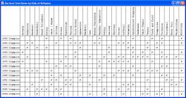
import com.lowagie.text.*; import com.lowagie.text.pdf.*; import java.awt.*; import java.awt.print.*; import java.io.*; import sos.reports.*; /** * A sample method that demonstrates how one may use iText, * available at http://www.lowagie.com/iText/, * to export a report as pdf. This method was tested against * version 1.02b. * * @author Side of Software */ public class PdfExportExample {public static void export( JReportPane reportPane, OutputStream outputStream ) {try {// create a new document Document document = new Document(); // the document is in the PDF format PdfWriter writer = PdfWriter.getInstance( document, outputStream ); // open the document for writing document.open(); // use the default page format (alternative: can pass it as a parameter) PageFormat format = new PageFormat(); int width = (int)format.getWidth(); int height = (int)format.getHeight(); // create the pageable object Pageable pagedReport = reportPane.getFittedPageable( format ); DefaultFontMapper mapper = new DefaultFontMapper(); // for each page for( int i = 0; i < pagedReport.getNumberOfPages(); i++ ) {// subsequent pages must be created explicitly if( i > 0 ) document.newPage(); // use a graphics object that converts to pdf PdfContentByte cb = writer.getDirectContent(); PdfTemplate tp = cb.createTemplate( width, height ); Graphics2D g2 = tp.createGraphics( width, height, mapper); // fetch the page to render Printable printable = pagedReport.getPrintable( i ); try {// render the page using the pdf graphics printable.print( g2, format, 0 ); g2.dispose(); // crucial! cb.addTemplate( tp, 0, 0 ); } catch( PrinterException pe ) {// handle the print errors pe.printStackTrace(); } } // close the document document.close(); } catch( DocumentException de ) {// handle exception here de.printStackTrace(); } } } More ExamplesThroughout these web pages, you will find a number of sample reports. The following table provides a list of the examples and links to the source code.
Home | Contact Us | Privacy Policy
Copyright © 2016 Side of Software, a branch of Natavision. All rights reserved.
|
||||||||||||||||||||||||||||||||||||||||||||||||||||||||||||||||||||||||||||||||||||||||||||||||||||||||||||||||||||||||||||||||||||||||||||||||||||||||||||||||||||||||||||||||||||||||||||||||||||||||||||||||||||||||||||||||||||||||||||||||||||||||||||||||||||||||||||||||||||||||||||||||||||||||||||||||||||||||||||||||||||||||||